Arlington: Now With Climate Control!

While Houston entered MLB with the flashy Astrodome and then retractable roof Minute Maid Park, the Dallas-Fort Worth area resisted domes for almost 50 years. They spiffed up a minor league park and made everyone endure the sauna that was Arlington Stadium. Successor The Ballpark in Arlington was a handsome structure during its baseball life, but it didn’t solve the existential crisis facing any MLB franchise in Texas: it’s too damn hot. Eventually North Texas would have to learn its lesson, so Arlington chipped in a third time to build Globe Life Field. For $1.1 Billion it does its job of keeping everyone comfortable while watching a baseball game. But as Jeremy Clarkson often asks, is it any good?

Now that’s a good looking scoreboard
The correct answer (to me) is 5 (including the suite mezzanine).

Is it any good? Before I attended a couple of games at Globe Life Field to answer that question, I took the brief 60-minute tour there. It was the lowest tier of tour packages, which meant that I wouldn’t be able to go on the field or into any clubhouses. What I learned from the tour, combined with the experiences from the two games, will inform my experience at every ballpark I visit in the future. Because like it or not, Globe Life Field is the new standard, being the last ballpark built in the 30+ year run of new ballparks.

A better look at the seating arrangement from the lower club level

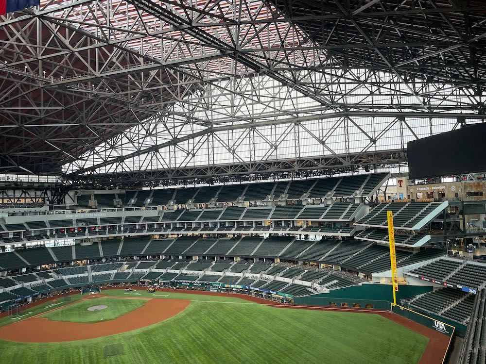
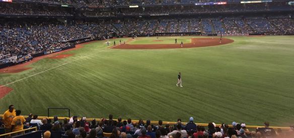
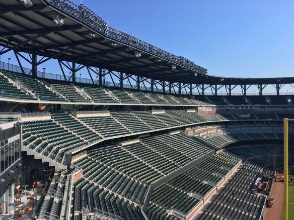
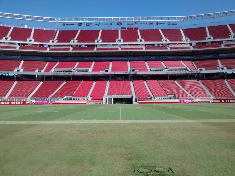
The tour and the main entry for both games I attended started in left field, where a large public plaza leads fans into the main concourse. From inside you can get a sense of the ballpark’s size and complexity. Black columns and beams evoke an erector set appearance. There are five seating levels including a separate suite mezzanine, with the upper deck and club level both split into upper and lower sections.

Arched concourse, a nod to the old Ballpark in Arlington

On the tour I was told that the Rangers set the climate to 72 degrees year-round, regardless of whether there’s a game. In light of Texas’s recent power problems that seems reckless. The justification is that it would be more costly to turn the air conditioning on and off instead of maintaining a constant temperature, a more relatable phenomenon in Texas (or Arizona where I live) than in coastal California. The main stadium entry I used happens to be sponsored by TXU, a leading provider in deregulated Texas. TXU is also owned by Vistra, which also owns the small power plant next to Howard Terminal.

Coming in from 90-degree humid Texas heat to 72-degree air-conditioned comfort is, well, bliss. It’s truly a nice improvement over my experience at Minute Maid Park, where the cooling system wasn’t nearly as efficient and I spent a lot of time sitting directly under a duct in the upper deck.

So is there anything else to rave about besides the HVAC system? A little.

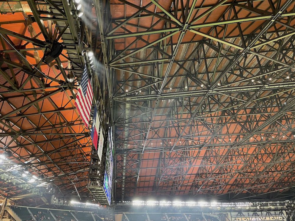
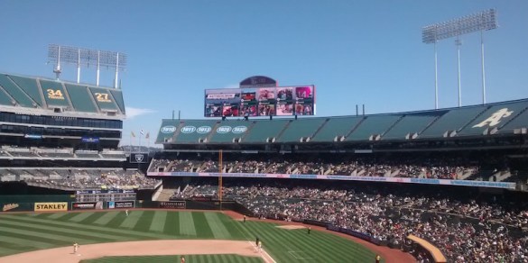
Summer officially started the week I arrived, and there was no chance I’d get to see the roof open or experience an open-air game at GLF. That’s too bad, because the way the roof is designed it probably would be the best open-air experience of any retractable roof stadium aside from T-Mobile Park in Seattle. Unlike most of the retractables of years past, GLF’s roof doesn’t open towards right field or symmetrically like in Phoenix or Milwaukee. In Arlington the roof opens to the west and stows behind third base. The Rangers open the roof during April and some May homesteads depending on weather. Whether the roof is open or not, there remains a fixed roof in right field that houses the scoreboard and part of the outfield as well. The roof takes 12 minutes to open. The resulting opening is 5.5 acres in size, much larger than the football field-sized hole at JerryWorld.

View of roof from center field upper concourse

About that GLF roof: I’ll be nice and say it’s functional. Like US Bank Stadium in Minneapolis, the top of the roof is covered with mostly transparent ETFE panels. ETFE allows for natural light to filter in. Unfortunately, the other two-thirds of the roof (nearly 4 acres) is covered with a rubber membrane. The Rangers got some flack locally when they revealed this, as their initial renderings showed a glistening roof that would’ve been covered in ETFE. Sadly, value engineering won out because of materials costs and the need to control the energy bill, so they went with a better insulating material for most of the roof. When I saw pictures of it online a couple of years ago, I thought the rubber sections were actually steel, as is often used in retractable roofs. Only when I got closer did I recognize what happened. The explanation made more sense in hindsight. It’s really too bad they didn’t use ETFE all the way around, as it promised a visual appeal that isn’t possible now. That said, I wonder if it would’ve been like what was done originally at the Astrodome, where skylights were installed to help grass grow there. That experiment failed miserably.

The retractable part of the roof meets the fixed part in right field, scoreboard visible

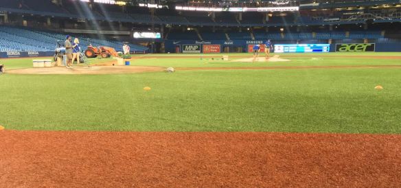
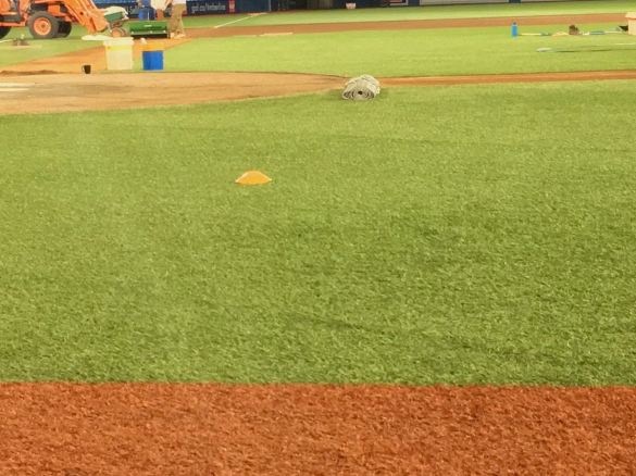
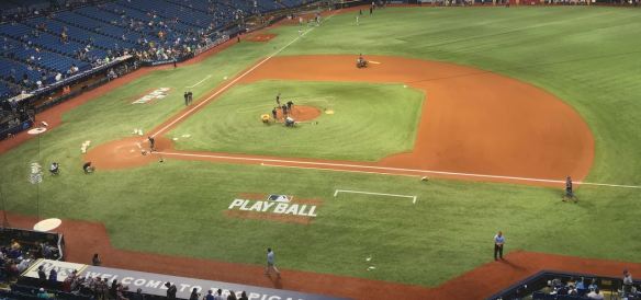
The field at GLF is 50 feet below street level. Fans can take separate escalators to the upper decks or the lower club level, which is more easily reached by elevator. The playing surface is Shaw Sports B1K, just like the recently installed turf at Chase Field. Something about how these surfaces diffuse and reflect light makes them look better in person than on television, where the effects appear harsher. At GLF there’s a normal dirt infield while the warning track is made of crushed brick.

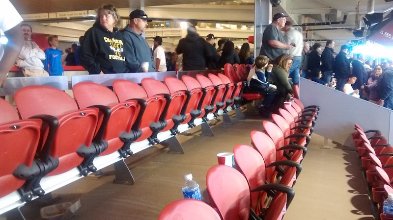
The closest row of seats is only 42 feet from home plate, though the seats are part of one of the lower club suites. The Rangers pioneered the bunker suite at the old Ballpark, expanding the offering at GLF. Now there are suites all the way around foul territory with the exception of the dugouts. Add to that the netting from foul pole to foul pole, and you have the first ballpark with no field-accessible seats. For that, GLF deserves the moniker “first post-pandemic ballpark.” If the best regular seats are a buffer and a net away from a fake grass field, is it truly baseball? I suppose it’s a type of baseball, and given the compromises, worth it for some. 

One of the many unused picnic tables

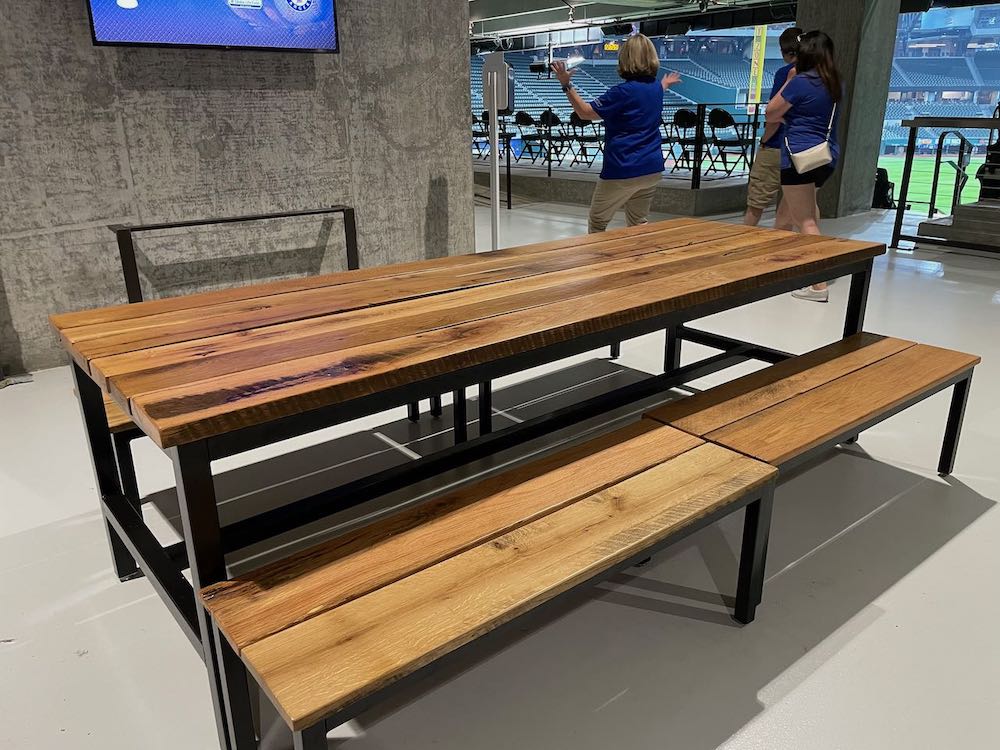
Throughout GLF the Rangers installed touches to give it a more cozy feel. Like the old Ballpark, picnic tables are all over many of the concourses. While they look inviting, they’re rendered unnecessary in a climate controlled environment. At the old ballpark, the picnic tables were a nice refuge for fans stuck on the concourse in the sticky heat. At GLF, where the walks to the seats are shorter thanks to shallower seating decks, fans aren’t as compelled to find a respite and are more motivated to return to their seats. As a result, I rarely saw any fans using the picnic tables during the two games I attended.

Rocking chairs on upper concourse

Former Rangers minor leaguer Alex Smith started his own company, Rockerman, which supplied wooden rocking chairs for use in the upper deck in left field. After some fan confusion about whether the chairs were ticketed seating or first come first serve, the team decided to sell them for games. The chairs help humanize a place that surprisingly lacks much of the down home Texas charm I expected coming in. Maybe that will all settle in the way a person breaks in a pair of jeans. Maybe not. The upper deck in left field also has an lounge area that doesn’t require a separate admission to enter, making it convenient for meetups.

Open office plan or ballpark?
Mall or ballpark?

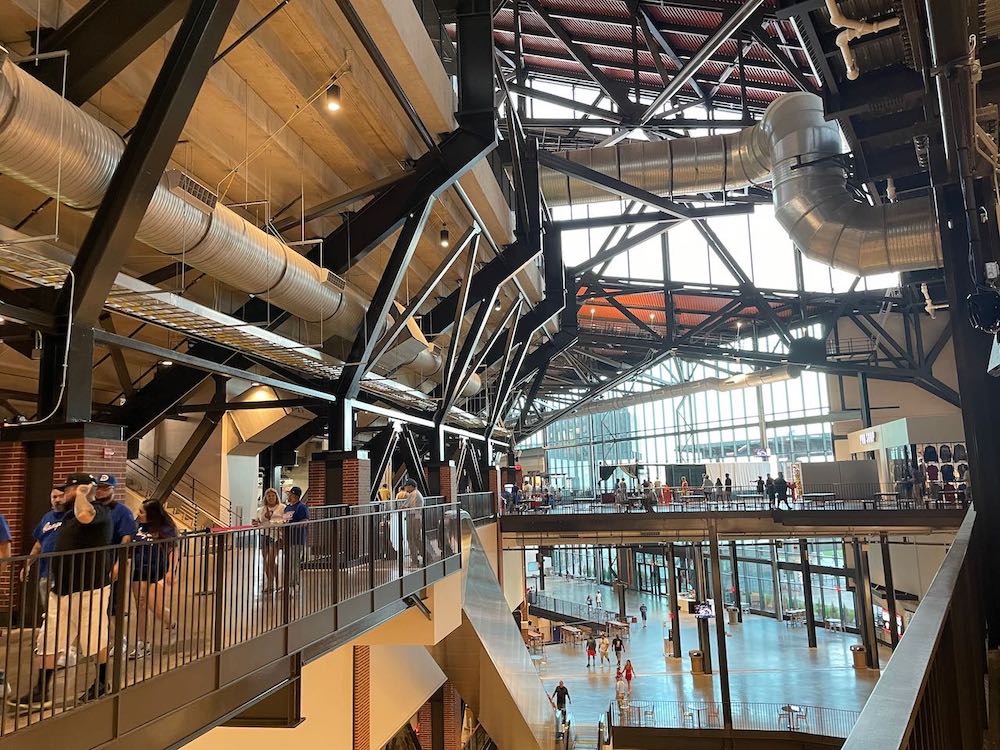
The upper concourse behind home plate is truly baffling. It’s a cross between a hospital wing and an incomplete mall extension. Unlike other concourses, there is no view of the field. Instead there are stairs and tunnels leading fans to their seats, including a half-level serving the 300-level sections. What’s missing is fun and color. If the Rangers are guilty of value engineering the roof, they’re equally culpable for the upper concourse drabness. It’s nothing that couldn’t be fixed by some paint and vinyl, but you have to wonder how much regard the team has for fans in the cheap seats when they couldn’t be bothered to provide fun branding or signage (ads?) when the place opened.

Airport terminal or ballpark? Note impressive ductwork

I know many of my critiques come off as reverse snobbery. Believe me, I understand that there’s a budget, and every project has to set priorities as no budget is unlimited. As a venue, GLF comes off as competent. The scoreboard is huge and well placed over right field. The main goal, to get more fans via a more comfortable experience, is working to an extent. For now, though, Globe Life Field feels way too uptight. The black beams everywhere are a step towards formalwear when all you want to do is get rid of the button-up and wear a T-shirt. The sound is decent and will be tested by Elton John, who plays GLF in September as part of his farewell tour. Someday I’d like to come back when the roof is open. Maybe that’s all the place needs to loosen up.

Comparison of three generations of Rangers ballparks

A Confluence of Events

Today we’re gonna have a little history lesson. Ready?

The date was October 17, 1989.

Remember that? It was the date of the Bay Area’s most unforgettable recent tragedy. The Loma Prieta earthquake struck at 5:04 PM, shortly before the scheduled first pitch of Game 3 of the 1989 World Series. The world’s eyes were trained on the Bay Area. After the temblor, nothing would be the same.

Houses fell and caught fire in San Francisco’s Marina district. The Cypress structure (880) in Oakland collapsed, as did a segment of the Bay Bridge and much of Pacific Avenue in Santa Cruz, which was close to the epicenter. When the quake struck I was a 13 year-old in my parents’ bedroom, watching the pregame on a 13-inch Goldstar (later LG) television. I didn’t have a table to hide under. I didn’t seek out a doorway to protect me. Instead I backed away from items that could fall, switched off the TV, and kneeled like I was praying the Novena at my local Catholic Church. The house was a classic single-story, postwar tract home that sustained no damage. After the shaking ended, I went outside and gathered with the neighbors. Power was out and would remain that way for two days. There was a rotten egg smell wafting in the air. Bewildered, we all took stock. There were no injuries on our block, no medical emergencies to further tax the public safety department.

Officials all over the Bay had much more damage to assess after the rescue efforts. The Marina would be rebuilt, as would the east span of the Bay Bridge. The Cypress structure’s replacement was eventually rerouted around, not through, the residential areas of West Oakland. The old structure was torn down to make room for a boulevard called Mandela Parkway. When I visited downtown Santa Cruz as a college freshman, much of Pacific Avenue was not yet rebuilt and would take years to be completed as the region dealt with the recession.

Loma Prieta triggered a series of planning decisions that would change the Bay Area in major ways. Besides what happened in West Oakland, the closure of the Oakland Army Base allowed the City and Port of Oakland to start planning for an expansion of the Port. The quake gave SF the excuse to tear down the unsightly Embarcadero Freeway and shelve forever any plans to complete the network of freeways through the city. That provided the impetus for SF to beautify the inner waterfront area, turning the Embarcadero into its own tourist and commercial attraction. Development creeping southward into SoMa finally resulted in a winning ballpark site proposal at China Basin, on the waterfront near the Caltrain terminus. Out of tragedy came rebirth and triumph.

As part of the Embarcadero rebuild, SF essentially ceded much of its shipping industry capacity to Oakland and Richmond, who were only happy to take up the slack. Military cutbacks included facility closures (OAB, Alameda NAS, Mare Island, Moffett Field NAS, etc.), prompting those cities to accommodate workforce transitions however they could. Since then, the BCDC has been careful to balance out the various needs of industry, residents, and civic services on the Bay’s navigable waterways. To that end, there is precious little residential development right on the water. Even the Brooklyn Basin project, which went through its own form of development hell for more than a decade and won’t be fully completed until 2038, was only approved with a mandated open space buffer for public use. Those same principles guide the development of Howard Terminal.

Could a ballpark be part of a grand bargain?

Last month the BCDC released an updated Seaport forecast, projected to run through 2050. The last Seaport plan is over 20 years old, so updates are welcome. The document was commissioned in January and completed by The Tioga Group, a freight shipping consultancy. An appendix dealing with the issue of Howard Terminal was tacked on at the end (page 177). Among the document’s observations include the following items:

About Bay Area Seaport growth and how Howard Terminal fits in:

  • Under moderate cargo growth assumptions the Bay Area will need more active terminal space, estimated at about 271 acres by 2050.
  • Under slow cargo growth assumptions the Bay Area will need about 36 acres more active terminal space by 2050.
  • Under strong growth across the three cargo types, the Bay Area will need substantially more seaport terminal space, about 646 more acres than is now active (and will need to activate additional berth space for larger container vessels).

As part of maintaining that delicate balance, it’s up to the BCDC, Coastal Commission, State Lands Commission, and cities and counties to best determine how the extremely limited resource we’re discussing – waterfront land – will be allocated and used. Howard Terminal is not being used to anywhere near its capacity, that much is clear. However, does its current state foreclose opportunities for the future? The report indicates that it would be foolish to do so.

As the analysis of overall seaport acreage requirements shows (Exhibit 199), Bay Area seaports are expected to be at or near capacity by 2050 under moderate growth assumptions, and to require space beyond existing active container, ro-ro, and dry bulk terminals. Howard Terminal would be one option to supply part of that acreage. Howard Terminal cannot, obviously, serve all three cargo types. If Howard Terminal is used for container cargo, other sites must accommodate the need for ro-ro and dry bulk capacity. If Howard Terminal’s’ long-term ability to handle containers is compromised by a truncated berth, ro-ro or dry bulk cargo may be a more suitable use.

Is the best way to utilize a limited resource to give up on it completely? That is the real question here. Not only is there not enough existing capacity for future growth, Howard Terminal’s small size and capacity means it can address needs one way at a time. Keep in mind we got to this point thanks to a combination of back room deals. Port operators sued to get better terms, which led to one of port operators to claim bankruptcy and pull out of Oakland altogether. During the City Council session earlier this week, a representative of GSC Logistics hinted that there’s talk of that same kind of withdrawal occurring again if the Port/City proceeds to build the ballpark at Howard Terminal. If that seems like dirty pool, you’re right, it undoubtedly is. Problem is, what is the line between a negotiating tactic and a long-term strategy? Moreover, what is a proper compromise? The A’s are willing to give up 10 acres of Howard Terminal to get approval from the Port shipping interests in what clearly will be part of a much larger package of concessions. Even if a compromise is reached, it doesn’t address the overarching issue above.

The photo above imagines Howard Terminal with a Ro-Ro (rollon, rolloff) facility built on it, which would be used for transporting cars. The rail spur currently at the terminal would be improved as part of a package of improvements. It’s not stated as the preferred option, but it is an option, and it’s quite convenient that the Tesla plant in Fremont happens to be the closest car plant that could use a Ro-Ro like this.

There’s also a tidbit about Schnitzer Steel thrown in for good measure.

Scrap metal

The three export scrap metal terminals in the Bay Area are located at the ports of Oakland, Redwood City, and Richmond, and each have substantial material handling infrastructure that could not be readily moved or duplicated. Should existing terminals reach capacity, there are limited expansion opportunities within port complexes.

As a private terminal in Oakland, Schnitzer qualifies as one of those facilities that can’t be readily moved or duplicated. So much for my idea from a few months ago.

I didn’t bring up Loma Prieta as some wish for divine intervention to spur civic planning. But it’s becoming clearer everyday that something more than a back room deal will need to happen to will a Howard Terminal ballpark into existence. The shipping industry is particularly livid with their claims about not being heard by the Port/City. Something has to give, and it has to be something big. Getting all of these parties to co-exist peacefully was always going to be a difficult ask. The issues have come into sharper focus in the last several months.

Last week, Dutch shipping giant Maersk announced an initiative to get to zero carbon emissions in its operations. When I read that I immediately imagined Oakland as a completely green port, with supertankers running on biofuels, electric cranes and port equipment, and non-fossil fuel powered trucks transporting goods all over the country. There’s no telling how much it would cost for such a transformation, but there is no better time to figure it out than right now, while everyone’s figuring out how much infrastructure will cost at Howard Terminal. If something like that comes to fruition, it could solve all of the problems that plague this concept: infrastructure, pollution, and traffic. And if that is part of the grand bargain that comes with a ballpark at HT, so be it. Like everything associated with this project so far, there’s no shortage of feature creep.

The Future is Fake? version 4.2

My younger brother bought a house in Mesa several years ago. I stayed with him at that house when I moved to Arizona. While he owned it, he chose to rip up the concrete patio and put in an artificial turf surface, a popular thing to do with a desert backyard. While we rode out a particularly rough monsoon, I watched as the rain threatened to flood the remaining concrete areas, yet efficiently and efficiently drained at the artificial turf patch.

Since then I’ve had a chance to take tours of several stadiums. I walked on natural grass and artificial turf systems for baseball, football, and soccer. Mind you, I didn’t field ground balls or practice cutting on turf, so I can’t speak to how well it’s working. A great deal of R&D has gone into perfecting these turf systems over the past 50+ years, which you can see on display every weekend. So-called third-generation products like Field Turf have become the surface du jour for football and field hockey, while soccer and baseball players tend to be more skeptical. It’s gotten to the point where there are formulations for the specific sports based on how much contact the ball has with the surface. We’ve come a long way from the old Astroturf with its rock hard carpet that caused ridiculously high bounces and rug burns. The new stuff is designed to be better playing, better draining, and most importantly for fans, better looking.

It’s not perfect yet, but in three ballparks I visited over the past three years, it’s easy to see how the technology has progressed. I capped off the 2017 season with visits to Toronto and Tampa, where new turf systems developed by AstroTurf and Shaw Sports Turf. Here in Phoenix, the Diamondbacks decided to replace their grass at Chase Field with a newer version of Shaw’s turf. So now we have three different iterations of the product in three MLB domed stadia to judge.

The Blue Jays’ Rogers Centre was the first with the latest generation of turf in 2015. In conjunction with the new turf, a full dirt infield was implemented. This was possible because the stadium’s football and soccer tenants moved to their own venue, BMO Field. The turf is called AstroTurf 3D Extreme, and nearly four years in, it’s a huge improvement over the old stuff.

Rogers Centre upper deck

Rogers Centre field level from dugout

Rogers Centre surface closeup (note warning track)

Cosmetically, it still looks like carpet. At least it doesn’t have the strange sheen of the stuff at the Trop in St. Pete. This product is named TruHop.

Tropicana Field from upper deck

Tropicana Field club level view

Tropicana Field outfield view from lower deck

Over in Phoenix, a newer version of the Shaw product was installed before this season, called B1K. These products are subject to nearly constant iteration. The old versions of artificial turf would often have a multi-year life span. Right now the emphasis appears to be on getting as true a bounce as possible while reducing the amount of “splash” from the crumb rubber infill, so it’s likely that the composition of the turf or dirt could change from year to year.

Chase Field outfield view from LF corner

Yours truly on the Chase Field warning track

Sorry guys, when I saw this picture from the tour guide I recognized this shirt is WAY too big for me now.

Here’s the funny thing about these technologies. As turf becomes a more complex product to install and maintain, it requires more resources. It’s normal to water the turf, not because anything’s growing there, but rather to keep its plastic and rubber from compacting and drying up. Meanwhile, grass always seems like the more environmentally sound product due to it being organic, yet it requires lots of precious water and fertilizer has numerous chemicals.

Look, the next ballpark in Oakland is not likely to have an artificial surface. Baseball’s ancient pastoral feel is more than a field, it’s a milieu. Whether we’re talking about kids running the bases after games on Sundays, or the occasional fireworks or movie night on the grass, people want to experience it. It matters more in place that, unlike California, actually experiences all four seasons. Yet it still matters on the West Coast. It’s just nice to know that science is working the resolve many of the problems that plagued the older versions of turf. Chase Field may be replaced in the next 10 years. If it does the replacement will probably utilize turf. The next ballpark for the Rangers will be in a dome and will also use turf. MLB and the owners are looking at the turf experiments in Phoenix, St. Pete, and Toronto to guide their processes in the future. Who knows, ten years ago there were several improvements in grass (mostly by impregnating plastic) to make it more durable. Perhaps more innovation is due on the grass side. Whatever happens, it’s good to know that the gap is closing. Here’s to hoping the green we see out there is more than a color, it’s an attitude.

SunTrust Park: More Braves, Less Atlanta

SunTrust Park in left field as twilight approaches

After visiting the Braves’ new park a month ago and giving it a good amount of thought, I came to the conclusion that in many ways, it is the future of ballparks. That is not necessarily a good thing. The advent of full-scale ancillary development with ballparks will change the economics for some franchises where it’s available. We can’t truly judge that impact yet, so I’m going to mostly focus on the ballpark itself, with some observations about The Battery, the development surrounding the ballpark, along the way.

I’ll start with the good news. SunTrust is a real improvement on Turner Field inside the gates. It’s much more compact and intimate than Turner, while also having more amenities and luxury within. While I’m with the near-universal criticism that the Braves chose to make this move far too early, abandoning a perfectly functional 20-year-old building in the process, I also have to note that ballparks have come a long way in 20 years. I just don’t know that it’s worth the investment, especially if you’re not getting a public subsidy to help pay for it.

Four decks and three separate concourses serve the stadium

33 rows fill the lower deck, which itself is split into upper and lower sections. The club and premium seating sections are all stacked behind home plate, much like Marlins Park. Large group seating exists down the lines, with the Hank Aaron Terrace overlooking left field and the Coors Light Below The Chop bunker beyond the right field wall.

Braves Monument Garden on lower concourse behind home plate

The biggest achievement is the Monument Garden, a spacious and quiet mini-museum along the lower concourse. Suites block access access to regular seats, allowing Populous to eliminate restrooms and concession stands, replacing them with this meditative space. The Braves are the longest continually operating franchise in MLB, and the team will let you know about it with numerous old jerseys, a long timeline covering the team’s history in Boston, Milwaukee, and Atlanta, and the various Hall of Fame Braves. BBHoF plaques are mounted along the concourse wall, while their numbers stand in water features in the center of the Garden. While it doesn’t have a bar as in Seattle, there’s a lot more history to cover, so take your drink in and meditate in the Garden for a while. Having a concourse view is preferable, but if you’re going to remove that view, at least give fans something cool like this.

Hank Aaron statue atop Monument Garden

This same attention to historical detail is repeated all over the park. The terrace club allows the patricians to feel the same sense of history without having to share space with the plebes.

Technology is solid, as one would expect with a park dubbed the “future of ballparks.” The two large display boards in the outfield complement each other, though at times it can be confusing determining which one is the main board. There’s a single ribbon board above the lower deck. WiFi antennas are ubiquitous, with internet provided by Comcast. The cable giant even moved its local operations to The Battery, occupying the big glass office building in right-center.

Banks of LED lights can be turned on, off, partially lit, or with strobe effects.

Sandlot kid’s area behind CF

As perhaps an unintentionally nod to the declining popularity of youth baseball, there is no sandlot diamond at Hope and Will’s Sandlot, the designated kids’ area. Instead, there’s a zip line and a climbing wall, which when I think about it, would be neat additions to the actual playing field. Think about it, Rob.

The REAL future of ballparks

The level-by-level diagram shows you the real future of baseball. Every perceived premium space and seat is now at the field, along the infield, and most importantly, behind home plate. I wrote about this evolution in May. With the opening of SunTrust Park, it’s further confirmation of the concentration of high-$, high-amenity seats, as well as the separation of those premium sections from the regular seats. The Rangers’ ballpark is sure to follow in these footsteps, if not surpass the Braves’ efforts entirely. Think about that the next time you sit in 315-319 at the Coliseum. The cheap upper deck ticket behind the plate is not long for this world.

Catwalk leading to upper deck sections behind the plate

Like the lower deck, the upper deck concourse behind the plate has no view of the field. The press box is located there instead, with few amenities (a couple concession stands and restrooms) available. Since there are seats in the upper deck, access to them is granted by stairs leading to a catwalk on the roof of the press box. It’s these inconveniences that make me wonder what’s next in terms of ballpark development.

Pre-construction rendering of The Battery ATL and SunTrust Park

Like it or not, the theme everywhere at The Battery is Coming Soon. While the main plaza beyond right field has retail and restaurant tenants, many of the other buildings to the south (bottom of pic above) are not fully completed. The developers managed to get commitments to thousands of apartment leases, ensuring that there will be some amount of activity when the Braves aren’t playing. Signs on the ground level advertise a good mix of retail chains and local establishments to come. It’s hard to say how successful this will all be because the Cumberland area where The Battery is located already has three large shopping centers in place, including a major regional mall. And with the Braves treading water at the .500 mark, the team for now is a coming attraction, whereas the ballpark is already in place.

I didn’t drive to the park when I was there thanks to accommodations only a mile away. Many of the parking lots are in office parks on the other side of I-75, requiring a stroll over the interstate on a newly constructed pedestrian bridge. Some parking exists at The Battery, though most of it is for VIP’s and residents of the complex. It’s a mess, albeit one I didn’t get to experience directly. Since the area doesn’t have a MARTA (BART-like) stop anywhere close, fans hoping for reasonable public transportation are bound to be disappointed by having to use at least two bus transfers from the Midtown stop. A better option if ridesharing from Midtown, which for me cost about $15 a ride.

My hotel would be in the lower left of this map, putting me closer than a lot of fans who parked nearby

Planning for the ballpark always seemed like a head scratcher to me. The land on which the ballpark and the development sits is 60 acres of former forest land that is sloped down from northeast to southwest. That makes for suboptimal ballpark placement and orientation. The Braves chose to place the ballpark in the northeast corner, with home plate facing nearly true south. When sitting in the ballpark one can look towards right field and see the rest of the Battery. The rest of your vision is freeway and greenery interrupted by the occasional office building or hotel. It’s not a skyline, the site’s distance from downtown Atlanta is too far to incorporate the skyscrapers in the distance. It may have made more sense to put the ballpark at the south end, orient it a more natural northeast, and build the surrounding stuff to fit. The plan could have allowed for fans parked to the north to descend to the park, creating a grand entrance in the process. The location is clearly suburban and while it’s suited for a neighborhood ballpark, the plans reach much higher to be more of a downtown ballpark (there are clear differences). All in all it feels like a missed opportunity.

The Chop House is a restaurant. Don’t make it more than what it is.

That brings me to the most popular criticism of SunTrust Park: the park’s lack of a signature feature. It’s hard to come up with such things when there’s no existing building to incorporate into the park (San Diego, Baltimore) or a small, hemmed-in site to force design decisions. The Braves so far are trying to use the Chop House as that signature element. The effort falls flat because it tries to puff up the Chop House to being more than multi-level restaurant that it is. Even if you accept the premise, the Chop House is not impressive enough nor of a scale to demand that kind of attention. It’s only open during games. Other group accommodations are directly above it, blunting its visual appeal. The Comcast building looms behind it, much more imposing but outside the actual ballpark footprint. I’m not going to call it the whole package “fake” or “artificial” because those are cheap shots that don’t get at the heart of the issues. Over time the place will fill out and wear in like a pair of jeans. Question is, will those jeans be out of style in 10 years? Knowing what we know about the last 30 years of ballparks, the answer is probably yes.

Hypothetical: If the Raiders left, how would you improve the Coliseum for the A’s?

Before I begin, let me preface this post by stating that I have no information that says definitively that the Raiders are leaving Oakland. This is mainly a thought exercise. The Raiders could conceivably leave for a new football stadium next to the existing Coliseum. They could go to Santa Clara or San Antonio for a few years before returning permanently. They could leave for Inglewood or Carson for good. In any case, this is meant to be a discussion about benefits for the A’s, nothing more. What happens to the Raiders is not under the A’s, A’s ownership’s, or fans’ control. There’s little East Bay politicians can do save for writing enormous checks to Mark Davis. So for the purposes of this post, let’s leave what the NFL and the Raiders may or may not do out of it. 

Should the Raiders leave for God-knows-where after the 2015 or 2016 football seasons, the A’s and the Coliseum JPA will have some serious choices to make regarding the old venue. The main goal would be to make the Coliseum a more pleasing baseball environment for players and fans alike, while not costing an arm and a leg to do so. The cost issue comes into play because, if we’re assuming that the A’s would pay some amount for this transformation, there’s a question of how much they’d be willing to put into this project as opposed to funneling more money towards a ballpark on the same grounds. That’s the tension at play, and when considering the various decisions that have to made cost-benefit should be at the forefront.

The immediate change we can safely assume the A’s will make is to take control of the Raiders’ locker room, one floor above the A’s current leak and sewage-plagued clubhouse. The Raiders got control of the old, 50,000-square foot exhibit hall space when the came back, turning it into spacious locker rooms for themselves and visiting teams. The A’s will occasionally use the area for hosting groups, since the Coliseum lacks proper breakout spaces at any level except for the East Side Club. Once the A’s commandeer the exhibit hall, the old clubhouse problems should go away. The old clubhouses could themselves be remodeled into memorabilia-filled bunker suites or other premium accommodations that are currently lacking at the Coli. It might cost $10-20 million to renovate the space properly, which might include moving the workout room, trainer’s room, and offices at the clubhouse level. Since all of the benefits would go to the A’s, it would make sense for them to foot the bill for the remodel.

Beyond that, changing the Coliseum could go in any number of directions.

Option A: Return to the pre-Mt. Davis Coliseum (cost estimate: $35-50 million). The frequent refrain I’ve heard so far is a call to transform the Coliseum into the pre-1995 version, with the old bleachers in the outfield and the ice plant above it. Doing so would require the demolition of most if not all of the Mt. Davis structure, plus the construction of replacement seating and landscaping. While that would be perfectly acceptable to the A’s and A’s fans, the City and County are still on the hook for the Mt. Davis debt, so the idea of spending more money on demolition and additional seats that would not generate anywhere near the requisite revenue to pay for them doesn’t sound promising in the slightest. Besides, how many years would this configuration be used? Five? I would expect all parties to pass on this plan if it were ever proposed.

Want the hills back? It'll cost ya.

Want this again? It’ll cost ya.

Option B: Lop off the top part of Mt. Davis ($10 million). The best way to bring back the view of the Oakland hills, without incurring the cost of completely demolishing and rebuilding the Coliseum, is to take down the upper part. What’s the upper part, you ask? Well, that depends. It could be as little as the upper deck, which practically starts as high as the rim of the original upper deck. Or it could include removing the upper two suite levels, making the total struck roughly as tall as the original upper deck’s lower rim. The BART plaza, East Side Club and associated seats (Plaza Reserved) could be kept around, though with the large number of obstructed view seats they’d serve a better purpose as an outfield restaurant bar, much like the kind many ballparks are instituting these days. On the downside, there would be a lot of expense just to open up the views. Again, it’s a high-cost/low-benefit situation.

Top of the original bowl is as tall as the bottom of Mt. Davis

Top of the original bowl is as tall as the bottom of Mt. Davis upper deck

Option C:  Leave Mt. Davis as is, fill in foul territory with seats ($25 million). Given the $100 million lower deck renovation at Dodger Stadium, this seems like I’m undershooting things quite a bit. But most of the money at Dodger Stadium went towards extremely well outfitted clubhouses and a large, swanky club restaurant behind the plate. There are some structural things to address, such as dugout expansion and realignment. The bullpens might have to be moved. One way to go would be to scrap the existing lower bowl and make it more like one of the original cookie cutters, like Shea or Riverfront. Chief benefits would be more seating at improved angles, plus additional concourse space in theory. However, it would be expensive to implement and would eliminate most of the views from concourse, at least down the lines. Plus the way the concrete beams that support the Plaza level are only 4 feet above the lower concourse floor, so a concourse expansion would have to be another 4 feet lower than the existing lower concourse in order to allow for proper circulation.

An expanded concourse has its downsides and challenges

An expanded concourse has its downsides and challenges

Option D: Move home plate back eight feet, bringing every seat on average 6 feet closer to fair territory ($5-10 million). Also known as the Ken Arneson plan, this proposal would sacrifice views from the Value (upper) deck in order to bring everyone else several feet closer. I like the idea of the Monster-type seats in the outfield, though I would also like to see a wholesale rework of the bleachers with steeper pitched seats if they’re going to add a premium option. That way the first row could be as little as 8-10 feet above the field, instead of the 15-foot high scoreboard wall that exists in the power alleys. While they’re at it, the metal “notch” sections that fill in either down the lines for baseball (sideline for football) should be replaced. They have a nasty tendency to pool water when it rains, and they’re more weathered than the permanent concrete sections. Changes like these certainly won’t be eye popping or easy to spell out in an offseason ticket sales pitch, but they can certainly help the vast majority of fans without incurring great expense.

The Giants and Cardinals both made changes to their venues as they waited for their purpose-built ballparks to materialize. In both cases, they built fan goodwill that was cashed in when their ballparks opened. Just as the A’s built new training facilities and rebuilt a ballpark in Mesa, a similar investment could pay off in Oakland. It couldn’t come until everyone knew the Raiders were leaving, so we wait. And wait.

Coliseum City: The campus that wants to be a downtown

Quick – can you guess how many downtown ballparks are in Major League Baseball? Downtown ballparks?

Would you guess there are 18?

Well, you’d be wrong. There are 15 downtown ballparks, half of baseball. They are:

  1. AT&T Park, San Francisco
  2. Busch Stadium, St. Louis
  3. Chase Field, Phoenix
  4. Comerica Park, Detroit
  5. Coors Field, Denver
  6. Great American Ball Park, Cincinnati
  7. Minute Maid Park, Houston
  8. Nationals Park, Washington
  9. Camden Yards, Baltimore
  10. Petco Park, San Diego
  11. PNC Park, Pittsburgh
  12. Progressive Field, Cleveland
  13. Rogers Centre, Toronto
  14. Safeco Field, Seattle
  15. Target Field, Minneapolis

All of these parks have one thing in common besides being located in a city’s central business district: they opened in the last ~25 years. Some are considered part of the portfolio of new classics, such as AT&T, Petco, PNC, Camden Yards, and Safeco. The rest, while perfectly good venues, are outclassed in one way or another. Many were anchors of large-scale redevelopment projects. Some were wildly successful (AT&T) while others couldn’t quite deliver on their promise (Comerica, Busch). Some are on the fringes of downtown. Others were placed on land that had a hard time being developed into more common uses (residential, office).

Missing from the above list are the most iconic older ballparks and their replacements. Fenway Park is in the Fenway-Kenmore neighborhood, 1.5 miles west of Boston’s compact downtown or central business district. Wrigley Field is 4 miles from Chicago’s Loop. Yankee Stadium is 8 miles from the southern tip of Manhattan, progenitor of the term downtown. Instead, these parks are in established neighborhoods.

5.2 miles from the Coliseum to downtown Oakland

5.2 miles from the Coliseum to downtown Oakland

Having legacy parks built away from the urban core was largely an economically driven decision, since it was often easier for team owners to assemble land away from downtowns. A century ago up through the end of WWII, parking was not a major issue, so the complications of having huge parking lots or garages didn’t come up. It was the pre-NIMBY area, with no environmental impact reports or CEQA. To say it was a simpler time would be an understatement. The ballparks thrived, gave the neighborhoods character, and became the landmarks we know today. Some of them at least. More likely, peers like Brooklyn’s Ebbets Field or Crosley Field in Cincinnati were phased out because they were too small, lacked parking for postwar suburban fans, or other reasons. In those situations, owners often turned to big, modern multipurpose stadia, usually in downtowns. As those modern replacements turned into ugly relics, they were themselves replaced by “retro” ballparks that harkened back to that simpler era. But they were situated in downtowns, not neighborhoods, so they didn’t quite have that magical character Wrigley and Fenway have. To date there hasn’t been a neighborhood park concept developed anywhere in MLB during the modern era.

..

An early rendering of Coliseum City

An early rendering of Coliseum City

Which brings me to Coliseum City. Throughout this entire Coliseum City process, backers have been selling the idea of this new, exciting, urban landscape, marked by glittering venues and tall high-rises. It looks like a second downtown for Oakland, doesn’t it? That’s a sentiment I had been hearing a lot since renderings by JRDV were released. Today this was confirmed by Andy Dolich, who wrote in an excellent piece at CSN Bay Area that the A’s have a good bargaining position for a future Oakland ballpark. The thing that bothered me was this:

Oakland is a gritty yet highly competitive city with suburbs, exurbs, and even far away counties with fans, businesses and broadcast entities that will support a coherent stay-at-home strategy for the Raiders and A’s. The desolation of China Basin turned into the Miracle of Mission Bay with AT&T Park as its nucleus. That same dream can turn into reality in and around the Oakland Coliseum site.

Let’s be clear about something. Coliseum City is not China Basin. Any attempt to draw similarities between the two is fanciful. China Basin is less than a mile from downtown and only 1/4 mile from South Park, long the ground zero for startups in SF. Combine that proximity with the touristy allure of the Embarcadero and you create that “miracle.” Oakland has a lot of land available at the Coliseum, but it doesn’t have any of those factors. The Coliseum complex is more than 5 miles from downtown Oakland. That’s nearly the length of Alameda, or longer than the Bay Bridge.

Coliseum City was conceived as a grab bag of everything a city politician might want to see developed on his/her watch: high quality office space, high-rise hotels, a fancy transit hub, housing, and yeah, those sparkling new sports venues that will keep the teams from escaping to other markets. Other than the presence of the existing BART station, there’s little to truly propel development. The complex is not a downtown, it’s an industrial area, so convincing developers and financiers to take a chance on the project has proven exceedingly difficult.

Take a look at the road plan below. The complex is somewhat screwed, because it’s hemmed in by a creek, railroad tracks, and the Nimitz Freeway on three sides. The lack of streets feeding into it creates a handful of major chokepoints. Tying them all together is a new loop road that traverses the complex. Downtowns don’t have loop roads. They have main streets. A loop road is something you’d find at a campus development. The infrastructure in place in and around the Coliseum is more suited to a theme park than a downtown.

Road plan for Coliseum City

Road plan for Coliseum City

A true downtown has a spine, a major arterial road through which transit and cars run. That’s not part of the Coliseum City, nor can it be. The major streets are a freeway plus San Leandro Street and Hegenberger Road, all of which form the perimeter of the core (downtown) area. BART also doesn’t run through, and it only provides one stop that can only access the “downtown” via a new pedestrian bridge. Downtown Oakland is served by two BART stations, both of which can be accessed from various streets and directions. Downtown SF has four stations.

plan

An elevated concourse serves as the spine of the plan and provides open space

See what I’m getting at here? The lack of multiple ingress/egress points makes this a complete nightmare in terms of access. Imagine a dual-event scenario at the Coliseum in which both the stadium and arena are in use (you could also use a 36,000-strong sellout baseball crowd as a benchmark). Both have events that start at 7 PM on a weeknight. Now imagine two-way traffic added to the mix: a few thousand office workers leaving while another few thousand residents arrive. That’s bustling, right? There’s another term for it: gridlock. Established downtowns have a street grid that by its very design can help mitigate that gridlock. Coliseum City doesn’t, and it shows in the EIR’s traffic study. Only small mitigation measures are identified, and some intersections have no mitigation at all. As a result, the main intersections or gateways all end up with Level of Service (LOS) F grades, the worst you can get. Traffic is a dual-edged sword. When in a neighborhood it’s a sign of vitality. It’s also a major annoyance. Expanding BART at the transit hub would help encourage patrons to use transit, but that’s not going to be for everyone.

The spine is an elevated grand concourse that connects the BART station/transit hub to the football stadium and extends to the rest of the development via stairways. It could even run across 880 to near the Estuary. While it will deliver people from the hub to the rest of the complex, it will also serve as a huge wall separating the complex in two. I’m sure the idea is to evoke the wildly successful High Line in New York, a former elevated train line that was converted into a greenbelt on the West Side. The concourse is going to be much wider and serve more uses than the High Line, which at most points is rather narrow. The High Line snakes through Chelsea, a little piece of heaven in a part of Manhattan that lacks parks. The thing about the High Line is that people generally don’t use it as a main way to move between places. It’s a diversion. CC’s concourse is meant to be a main drag, so much that it has a streetcar embedded within. I’m going to guess that if the development doesn’t expand much beyond the Coliseum complex, that streetcar is a nonstarter.

Concourse at Coliseum City

Concourse at Coliseum City

The High Line in Manhattan

The High Line in Manhattan at dusk

There’s a philosophical question to ask about Coliseum City. If so many people are talking about it in terms of a second downtown, what does that mean for the current downtown? Oakland’s downtown/uptown areas have survived the recession, riots and protests, and have gotten funkier and cooler in the process. It becomes a matter of how Oakland balances out the needs of a downtown that grew up on its own versus a planned campus development designed to resemble a downtown.

When you look at old parcel maps of the complex, you can see dotted lines where streets were supposed to be laid out. Originally the area was supposed to become a subdivision, carrying over the street numbering convention found on the other side of the tracks. I can’t help but think that the project would be more feasible and ultimately successful if its proponents tried to make it a real neighborhood instead of a planned campus. That would be the truly retro move: a neighborhood that works in scale with a ballpark, that doesn’t have pie-in-the-sky planning goals, that echoes the growth of other neighborhoods in Oakland. Yes, there would be parking as that’s a necessary evil piece of infrastructure. The plan would be complementary to downtown instead of competing directly against downtown. Chances are it would be more egalitarian than Coliseum City. If Oakland really wants to stand out, to make something special, it should stop looking jealously across the Bay for something to copy like a waterfront ballpark. A neighborhood ballpark, done the right way, would be that unique plan. Oakland could do that if it wasn’t so starry-eyed. Honestly Oakland, what would you rather have: a second competing downtown, or Wrigleyville/Fenway?

P.S. – When we saw the plans, Jeffrey (Editor at large) and I talked over some of the possibilities. One thing that we agreed on was that Oakland might have the best chance of developing the whole thing if Coliseum City attracted one or two major employers to take much of the office/R&D space. Say that a growing tech company in San Francisco wanted to escape the ultra-high rents there, but wanted space to expand on their own terms instead of leasing multiple floors in different buildings. Coliseum City presents one of the few opportunities to build a campus close to SF. It’s a potentially great deal for Oakland: high-profile company relocates to Coliseum City, leases a large amount of space, has its own BART station. In a way that feeds into the idea that Coliseum City is really a campus, because instead of 12 or 20 different companies taking up different amounts of space, you have one. The company has its own big commuter shuttle buses and a fleet of private Ubers coming in and out, just like Silicon Valley.

A Day at the Diamond, Hohokam Stadium Preview

The parking lots filled up fast, so that by the time I arrived at Hohokam Stadium around 11 I was directed to park in the grass soccer fields south of the ballpark. With the construction debris gone and systems in working order, it was time to show off the renovated ballpark to the community.

Fans walking in front of the clubhouse mural

Fans walking in front of the clubhouse mural down the 1B line

There were no surprises for me. I’ve checked out the place throughout various stages of construction over the last two years. What I wasn’t quite ready for was how it looked with a bunch of people in it, sitting in seats, traversing concourses, hoping for home run balls. For me that’s when it became more than a bunch of features and improvements upon Phoenix Muni or even the Coliseum. That’s when it became real.

Back row behind the plate

Back row behind the plate

From the top of the stadium you’re afforded views of the McDowell Mountains to left, Four Peaks and Red Mountain to right. Down low it’s all baseball. While the A’s have sold ads in the outfield, don’t expect the same kind of ad explosion you typically see in minor league parks and other spring training parks. The big scoreboard in left will probably be used for getting those messages across.

Exterior outside 3B

Exterior outside 3B

If you had visited Hohokam at any time since its 1998 renovation, you know about the edifice’s underwhelming blandness. A 90’s  ode to beige stucco, there were only the most minimal nods to the Southwest. Under the A’s, the Gensler-designed makeover is all green and gold. The exterior walls are the forest green we as A’s fans are very familiar with, perhaps darker than you might expect at first glance. Gold painted aluminum panels line the gates and box office. Originally the gates were to have famous player numbers, like 24 for Rickey Henderson. This was scrapped sometime in the last year, probably because having gates named in a “random” manner would look confusing to non-A’s fans. Not that the gate naming system matters, it’s unlikely anyone will get lost here. One bit of technology not available in the 90’s was large format, photorealistic vinyl, which was put to good use depicting major events in A’s history on the outside of the stadium (above) and throughout the concourse.

This slideshow requires JavaScript.

The inner concourse felt somewhat cluttered with numerous memorabilia sales tables on both sides. Only a few concession stands were open, so the space was made available. Most of the concourse is white, with gold accents to highlight fan amenities, from tunnels to the grandstand to restrooms and concession stands.

Ferguson Jenkins was even on hand, as he used to be when Hohokam was the Cubs’ home. Jenkins usually makes the rounds at every Cactus League park, so if you want to meet the Hall-of-Famer you’ll have your chance.

This slideshow requires JavaScript.

Unlike Phoenix Muni, at Hohokam fans will now be able to walk completely around the park. As a 90’s-era Cactus League park, there’s no 360-degree concourse like the kind you’d see at the newest parks: Salt River Fields, Camelback Park, Sloan Park. Even so, you can get your full stroll on, and the upper tier is elevated enough above the walkway that you won’t have to worry about obstructing views.

This slideshow requires JavaScript.

When Hohokam was redesigned, the Cubs made sure to get a large canopy placed over much of the seating area, as the old Hohokam had no shade whatsoever. That feature was carried over to Cubs/Sloan Park, and while the shade isn’t truly necessary for March in Arizona (75-80 degrees, dry heat) it’s welcome. If you want shade from the start, sit in the upper sections on the 1B side or behind home plate. The A’s also removed large bleacher sections down each line and replaced them with shaded patios, one a family and kids area, the other a beer garden. Along with the downsizing, all of the seats and bleachers. The plastic fixed seats are 19 or 20 inches wide, provided by Hussey Seating. Bleachers are contoured and have backs.

This slideshow requires JavaScript.

A's training facility at Fitch Park

A’s training facility at Fitch Park

Hohokam is 0.6 miles north of Fitch Park, home of the Lew Wolff Training Facility. The facility was not named LWTF in the initial drawings presented by Gensler nearly a year ago. Whether Wolff decided to do this at the last minute or was pushed to do so because of the drawn out Coliseum lease negotiations or other factors, the Wolff name is unmistakably on the A’s building in Fitch Park and on way finding signs outside Fitch. Wolff’s name is nowhere to be found at Hohokam, and both Hohokam and Fitch have retained their original names. Wolff turns 80 this year, so I can’t blame the guy for celebrating an achievement, no matter how distasteful it may look to many Oakland fans.

This slideshow requires JavaScript.

The outfield berm areas at Hohokam are arguably the largest in the Cactus League. In right, the berm is so large that it’s split into a good-sized lower part and a large upper hill, descending to a second walkway next to the warmup fields. The A’s have plans to rework these areas to include a food truck alley and a grotto in left, but for now they’re being left alone. In any case, you’ll have plenty of area to stretch, and maybe the team will add more kid-friendly attractions with all the space, as is seen at Peoria.

It's huge

It’s huge!

Last but not least, there’s the new scoreboard, which I’ve talked about previously. The A’s are experimenting with different graphics and sound packages, and from what I hear they’re not final, so you if you have suggestions chime in. One dilemma I heard about was whether to bring the “A*Team” theme and graphics over from Oakland or trying something different for Hohokam. I have a bunch of lawn tickets for games in March, and I made sure to plant myself in front of the display to see if I could stand the up-close pixelation. It looked fine to me, so I’ll make LF semi-permanent instead of RF, where I thought I’d be sitting prior to today.

The final price tag on Hohokam Stadium was $27 million, $17 million from the City of Mesa and $10 million from the A’s. The original budget was $20 million. Some of the extra $7 million went towards technological improvements, such as proper wiring for broadcast video throughout the park. While the A’s and Comcast don’t broadcast a ton of games during the spring, it’s good to know that the capability is there. Visiting teams will be able to take advantage as well.

A spring training ballpark is only used for a month every year. Games held there don’t count in the standings. It is more intimate than regular season baseball, more accessible. Every fan should take the opportunity to visit his/her team’s spring training home at least once. It’s warmer in more ways than one.

Shrinkage

When Coliseum City was originally conceived it was supposed to look something like this when fully completed, 800 acres in all.

cc-800acres

800 acre concept


Last last year we heard from Floyd Kephart and others that the project would be scaled back to around 200 acres.

cc-200acres

Coliseum City at 200 acres


Now we hear that it’s down to 120 acres, which is basically the original Coliseum complex plus the Malibu and HomeBase lots leading out to Hegenberger.

cc-120acres

120 acres


With the Raiders and A’s signed up to offer competing bids, the team working on Coliseum City now plays the role of facilitator and competitor, all at once. A single stadium’s footprint will be 14-20 acres. Two stadia would cover 35 acres. When you add the necessary streets and easements for other infrastructure, that should leave 60-70 acres to develop. I was not terribly optimistic from the get-go about the financing coming through, so I wasn’t surprised when one financier after another bailed out on the project. Now that the project’s size has shrunk a whopping 85%, the questions about its viability are even more pointed, especially when trying to pitch it as a way to keep both the A’s and Raiders in town. Just as we saw over the last year, we’re going to let the numbers (or lack thereof) prove these concepts out. If the Raiders can make it work with whatever developer they’re trying to get onboard, bully for them. If the A’s plans prove most feasible, then they get the spoils of developing one of the last large infill developments in the Bay Area. And if Kephart’s New City group somehow gets capital and the teams on board, they will have truly worked a miracle.

However, ask yourself this: If capital wasn’t biting at 800 acres and two stadia, why would they bite at 120 acres and two stadia? 

P.S. – The infrastructure price tag on the whole 800 acre project was supposed to be $344-425 million. Now that it’s 85% smaller, did that cost also proportionately decrease? Nope. The cost of infrastructure for the 120 acres, including the new transit hub and utility relocations, is $170 million. Factor that into your thinking. Some of that figure will be offset by grants, though really only for the transit hub. It’s still a nine figure infrastructure price tag.


Final thoughts on SF’s failed Olympic bid

The Winter Olympics in Sochi and Summer Olympics in Beijing set new, possibly unreachable levels of state-sponsored expenditures, all to show how healthy and resurgent Russia and China were in front of the world stage. There’s no need for such a dog-and-pony show in the US, so it was smart for the USOC to look for smart, cost-effective bids for 2024.

Boston beat out SF, LA, and Washington DC despite being smaller in terms of area and population than all three. Boston’s land mass is almost the same size as San Francisco, though it isn’t organized into a neat seven mile by seven mile square. It’s uneven, spanning both sides of the Charles River. Several suburbs butt up right next to Boston, whereas SF is surrounded by water on three sides. Sprawl was always going to be an Achilles heel in SF’s bid. BASOC tried to show a compact bid to USOC, but USOC wasn’t fooled. Boston presented a truly compact bid. SF faked it, new stadium in Oakland or no.

As I looked at the various bids, it became abundantly clear that a different factor hurts SF, and will continue to hurt SF every time it chooses to submit bids for the Olympics. The reasoning is simple.

San Francisco lacks a large, major university campus in or near the city.

LA’s bid was structured around a downtown hub anchored by Staples Center/LACC and the LA Memorial Coliseum, which happens to be next to USC. Two other hubs were at the UCLA campus in Westwood, and in Carson at the CSU-Dominguez Hills campus. Boston’s winning bid utilizes facilities at the campuses of Harvard and MIT in nearby Cambridge. Previously, China built arenas at Beijing’s Institute of Technology. Atlanta has Georgia Tech close to downtown. Athens suffered by building to compensate for not having preexisting venues, including many secondary facilities normally found on college campuses.

SF has three universities within city limits: tucked away USF, facilities-poor SF State, and UCSF. None of those schools have campuses large enough to house the kinds of venues the Summer Olympics requires. The closest large campuses are in Berkeley and Palo Alto. The Cal campus is 12 miles away, Stanford is three times that. Such a spread is tough sell when competing against more compact bid structures.

Blame it partly on the Bay. From a historical standpoint, San Francisco Bay had huge strategic value as a military port. There are forts on both sides of the Golden Gate, plus bases in the North, East, and South Bay regions. The government chose to build two large shipyards within SF city limits: Hunters Point in the southeast part of the city, and man-made Treasure Island. Protected harbors aren’t a dime-a-dozen, so you can’t blame the Navy from being protective. Had the Bay been filled in as was proposed at different junctures during the mid-20th century, we would’ve seen a much different scope of development with more density on infill closer to SF.

The Reber Plan would have filled in the Bay, provided new freshwater reservoirs, and new deep water harbors along the East Bay

The Reber Plan would have filled in the Bay, provided new freshwater reservoirs, and new deep water harbors along the East Bay

With more shipping uses in the new infill areas, SF’s waterfront could have been freed for redevelopment, including perhaps a major university at Hunters Point, or the Central Waterfront. There could’ve been a large campus with big time athletic facilities and mass transit built to accommodate the school. That’s what SF lacks now, and will lack for the foreseeable future. Ironically, SF eventually approved an expansion of the UCSF campus in Mission Bay, but UCSF is a graduate school, not a traditional four-year school with an athletic program.

Thankfully, the Bay was never filled in. It remains a visual and environmental treasure as well as a psychological barrier. The Bay is a body of water that makes SF seem elusive, adding to the unique form of provincialism Bay Area residents exhibit on a regular basis. There’s precious little room in SF for new permanent facilities. As a result SF will always be at a disadvantage compared to other bidders who only have to cross a river to navigate their respective regions. Bay Area civic leaders were smart not to approve filling in the bay. No number of Olympic hosting opportunities is worth it.

Levi’s Stadium: A nice place where football happens to be played

Friday’s high school doubleheader was an opportunity to showcase Levi’s Stadium to the public with a much cheaper cost of admission. Tickets were $20 for adults, $5 for students. Plus you got two games for the price of one, the first matchup kicking off at 5. I got to the stadium at 4. Temperature was 70 degrees in the stadium, with the sun ready to set behind the suite tower. Somehow the weekend avoided the “roasting” temperatures felt during earlier games, which is too bad. I was looking forward to experiencing it, seriously.

This slideshow requires JavaScript.

The tour on Wednesday didn’t allow me to traverse the big seating bowl opposite the suite tower. The games on Friday did, though not without their own limitations. Seats were sold as General Admission, which meant that fans could sit in any section that was open. Initially, that meant sections 110-119 along the east sideline, which includes club section at midfield (although the clubs themselves weren’t open). Stairs to the second seating deck were roped off. The entire southern concourse after section 120 was barricaded, which meant that fans entered through Gates A & F on the north side. That’s not really a problem considering the expected turnout at the event, which was at most 12,000. Eventually additional sections were opened towards the north end zone.

Ironically, although the lower concourse is the widest and most open of any in the NFL, the stadium is not set up for fans to walk around completely around the concourse, since every public space on the west side suite tower is some sort of limited access or VIP area.

This slideshow requires JavaScript.

Still, the lower concourse is enormous, as much as 150′ wide in some spots. It serves both “halves” of what the 49ers call the lower bowl, which is just a marketing gimmick. The 49ers call the first two decks the largest “lower bowl” in the NFL with over 45,000 seats. Only in the NFL can this go unchecked. I suppose they can get away with this because along the non-tower bowl, there is no publicly-accessible mezzanine concourse, only a level of suites. It’s a cheat, and only someone pedantic about such things (like me) will notice. It’s a cheat nonetheless.

The concourse is split in two, similar to the layout at Columbus’ AAA Huntington Park, except doubled in size. There’s the drink rail standing and wheelchair row area, then 60 feet of mostly unobstructed, walkable concourse, then another 60 feet of concessions and restroom facilities, and then another 30 feet of concourse on the exterior of the stadium. Concession stands are on both sides, while entrances to the restrooms are mostly in the alleys. It would all be a nightmare in terms of missing huge portions of the game, if it wasn’t for the 49ers placing great faith in the ability for fans to order food with their smartphones and pick them up in 5 minutes at an express lane. There’s even a $5 delivery charge if you don’t want to walk up to the concourse. The service was available during the doubleheader, but I wasn’t going to try it because the stadium was charging full priced concessions for a high school game. Come on, Santa Clara and the 49ers. Give fans a break. When I went to Dodger Stadium for the LA baseball championships two years ago, they sold hot dogs and popcorn at a cut rate, basically at cost. You’re already making bank off the NFL games and numerous other events guy, no need to gouge for this one. This is a CIF event, not a NFL event.

As I walked back and forth along the concourse several times, something about the paint and textures and fonts struck me. I couldn’t put a finger on it at first, then I understood immediately what it was. Take a look at the picture below for a few seconds, and figure out what’s missing.

levis_stadium-54-concessions2

We see:

  • Bright red and stark white columns providing contrast
  • A well-lit, easy-to-read description of the stand’s offering with no branding
  • Wayfinding signs
  • A pleasant picture of a marina (South Beach?) on the upper wall
  • A small Verizon logo in the distance

What’s missing? A 49ers logo. The only thing in this picture that might lead someone to believe that this is the home of the 49ers is the gold in the way finding sign, itself distinctly labeled “Levi’s® Stadium.” There’s no SF or 49ers logo, no vinyl poster of a great past 49er, no electronic signage for the team or anything else. Sure, during the game some of the screens will show the game. Other signs along the concourse are emblazoned with the Levi’s Stadium logo. Some of the wayfinding signs point to the locations of the 49ers Team Store, but that’s it. It feels like the 49ers’ branding is being suppressed in favor of Levi’s, which is strange. It’s not like there’s a Levi’s Outlet store in the stadium. Levi’s and the 49ers aren’t competing for anything, they’re partners. Yet the naming rights sponsor is definitely getting the higher profile. Perhaps the idea is to separate the branding between on-field and off-field, but even then it’s somewhat skimpy. I counted five 49ers logos – two in opposite corners along the field walls, one flag each in the north and south ends above the stadium, and one large logo at midfield below the east bank of lights. That midfield logo is in line with the rest of the non-Levi’s founding sponsors for the stadium, including Brocade, Yahoo! and United Airlines. That’s it. That nice marina graphic is matched by pictures of redwoods, SF row houses, the signature Bay Area bridges, and the Lone Cypress along 17 Mile Drive. It’s all very nice and pan-NorCal, as if people really cared much about being pan-NorCal. Celebrating the team and its previous exploits is for those who visit the museum, a relative rarity among NFL stadia. While the museum can be appreciated, it’s not necessary to create this weird church-and-state separation. The vast majority of major events that will be held at Levi’s will be 49er games. No need to hide it.

levis_stadium-57-rails_drinks_seats

Seats on rails, padded seats for the more privileged

How’s the stadium as a football venue? Pretty darned good. I ended up sitting in Row 4 near the 25 yard line, thanks to the Santa Clara High School band vacating their bank of seats. With only one-sixth of the stadium open there was no opportunity to walk up to the upper deck and check out the very last row to see what it was like compared to Mt. Davis. From my calculations the highest seat up there is 295′ by line-of-sight to midfield at the near sideline, compared to 334′ at Mt. Davis. Either is much further than the top of 317 at the Coliseum. The seating bowl is extremely swept back, with little in the way of overhangs. That makes the bowl less vertical than some others, about 20 feet better than in Cincinnati, Baltimore, or Philadelphia, whose multiple suite levels contribute to a greater overall viewing distance. Sweeping the bowl back so far helps create the massive concourse area. The approach wouldn’t be practical in a domed stadium, where architects usually try to conserve on overall footprint to reduce construction cost and keep operating expenses like air conditioning in check.

I was right next to the midfield club seats, which were served by one of the two BNY Mellon clubs. The club seats were nicely padded and high backed, my seat was not. Like AT&T Stadium in Dallas, the seats were mounted on rails, which allows the team to add and remove seats at their discretion. The system was devised by Camatic of Australia, the seat surfaces built in Hayward.

The place doesn’t feel cheap. It feels very precise. As the sun set and the stadium lights took over, I was astonished at how bright the place was. Without having any measurements, it looked much brighter and intense than the ‘Stick, Coliseum, or Stanford. The reflections off the skyboxes lent the suite tower a shiny, jewel-like appearance. Few suite holders were on hand to watch the festivities. Only a handful of people sat near the field on that side, making the SAP Tower look like an exclusive mall that was closed to the poor plebes. Go to a 49er game or the upcoming Cal-Oregon matchup to experience that.

Every column is double and triple supported by I-beams and diagonal tubes, playing up the “erector set” look.

We get it, it's earthquake country

We get it, it’s earthquake country

The scoreboards are labeled Sony, but we know that they come from South Dakota’s Daktronics, as Sony has vacated the LED display and scoreboard market since pioneering the CRT-based Jumbotron decades ago. They work as advertised, providing live feeds and replays, a huge sponsor panel on the left (the event the sponsor was Black Bear Diner), and a minimalistic score panel on the right. That panel showed score and time, but not down and distance. If you wanted to see that you had to look at the ribbon board at midfield, a constantly frustrating routine. Thankfully there’s only one ribbon board along the fascia of the upper part of the lower bowl (see how that falls apart?). There’s certainly potential for another ribbon board about the suites if the 49ers wanted to install one there.

The lack of another along the upper fascia highlights yet another omission: there’s no Ring of Honor. At the ‘Stick the Ring of Honor was painted under the vestigial roof rimming the upper deck. It didn’t carry over. The old roof rim wasn’t the most ideal place to put such a feature, but they did it and it worked. Now there’s nothing. I expect that the team will introduce something over time, having a great ceremony for each unveiling over then next few years. Yet again it’s another example of the 49ers’ brand being strangely muted or suppressed. It makes little sense. As someone from another team once said, “We’re not selling jeans here.” Oh, I guess we are.

This slideshow requires JavaScript.

With the crowd expected to be only a fraction of a pro football crowd, there were no special trains running to the stadium. Tasman Drive north of the stadium was not closed off. All in all it seemed like a typical Friday afternoon near Great America, with a good deal of the usual commute traffic but little gridlock except for the arteries leading away from the stadium before the game. The parking charge was $15 in only the nearest lots to the stadium. It would’ve been easy to scope out free parking if I was interested. I took light rail with a $4, 8-hour pass. Understandably, this is not comparable to the gameday problems many have experienced at games. However, the second game involved two teams from the Sacramento area – Jesuit of Carmichael and Elk Grove. I asked fans of both teams about their experiences coming driving to Santa Clara on a Friday night. All of them said that traffic was not an issue, the trip took about two hours, and for those who were also 49er fans, generally better than the area traffic for 49er games. I noticed that the same bag restrictions employed for NFL games were in effect for the doubleheader. That strikes me as a venue policy, not just an event policy. We weren’t allowed backpacks during the tour either.

In the effort to attract as many diverse types of events as possible, it feels that the image of the 49ers has been subsumed at Levi’s Stadium. It doesn’t need to be all rah-rah, gag-me-with-legacy tributes like many ballparks, but it shouldn’t be barely evident. The 49ers and Levi’s have time to achieve that better balance. Perhaps that will happen after Super Bowl 50, which isn’t scheduled for another 16 months. The NFL has a tendency to exercise tight control over potential Super Bowl venues. Personally, I’m much more a Levi’s fan than a 49ers fan and this is out of whack. Levi’s Stadium is the home of the 49ers, now and into the foreseeable future. It should act like it’s the home of the 49ers, not merely a place where 49er games are occasionally played.